L Gurini

L Gurini is a creative graphic designer, interested in design as a vehicle for understanding. Many of her projects and designs aim to “visualise” feelings, times, or experiences with the help of colour, texturing and hidden meanings. Gurini's work is highly focused on creativity, viewing design as an art form and a brief as an opportunity to be different and thought provoking, blending grit, precision and personal flare.

Some of Gurini's biggest interests in design right now include creating alternative event flyers, cover artwork, and creative poster designs, as well as pursuing her passion for metal-style logo creation. Her work is often inspired by alternative music, subcultures and the world of online “aesthetics”. She is now focused on expanding into merchandise and apparel design. Her designs often merge design principles from various eras, making nods to times before us and their relevance in the present.
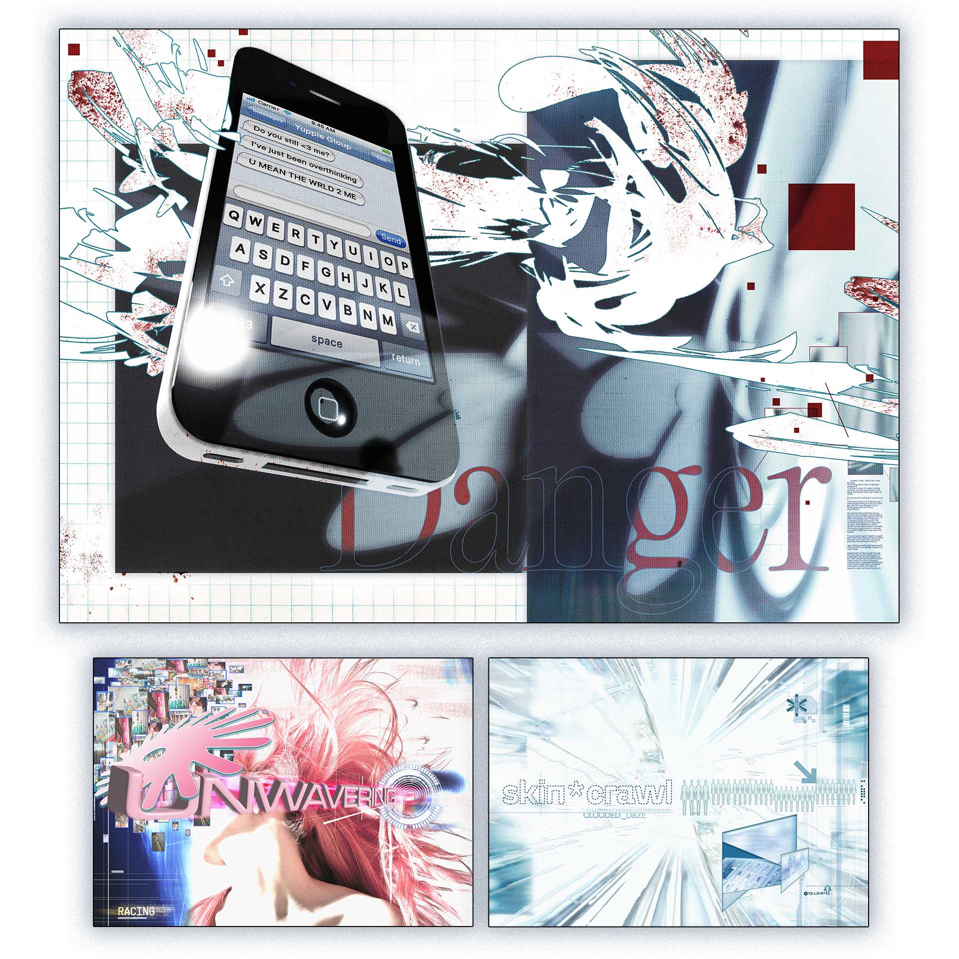
Design Voice - Visualising ADHD
Design Voice - Visualising ADHDDuring a project titled 'Design Voice', Gurini chose to go down the creation theme of “Identity”, creating a series of designs to express and visualise aspects of ADHD, from her own experience and the research on others'. This project was influenced by the meticulous teachings of the 90s-2000s design style “Metalheart”, where Gurini merged an abstract display of shapes, hidden imagery, digital aspects and colours to represent the feeling behind symptoms she feels people often misunderstand. This project also included “explanation sheets”, which colloquially spoke on these feelings, giving the designs context, in the hope of helping others to either feel seen, or understand ADHD a little bit better.
Final Major Project - Digital Fantasy Reality
Final Major Project - Digital Fantasy RealityFor Gurini's Final Major Project, she created a series of designs - from apparel, to a skateboard, to posters, to food and drink items - relating to the “2000s older brother aesthetic” to be showcased in her physical miniature bedroom. Alongside these designs and miniature, she also created a short booklet/zine explaining the reasoning for the designs, with a critical view about the way nostalgia is viewed. The pages titled “Digital Fantasy Reality & it's connection to nostalgia”, “Need to slow down?”, “What is core?”, “The categorization of your life”, “Feel the world is losing colour?”, “The 20 year trend cycle and why nostalgia isn't your fault” and “Are you addicted to TikTok?”. This project commented on many aspects of nostalgia and the worlds admiration of it, but ultimately looked to question the way we view nostalgic “aesthetics' and microtrends and internet “cores” today and how the speed of the internet may have played a part in the speed of nostalgic trends.
The Handle - branding project, JDO
The Handle - branding project, JDODuring the “Work Based Learning” project with Ravensbourne University London, Gurini participated in a group branding project, lead by the company JDO. Her group consisted of creative students: Ario Nahavandi, Zakia Miah and Elliot Hill. In this project, they had to choose a random sport and a random body care product to create a brand from, within JDOs timeframe and guidelines. Their product was created from cycling and bubble bath. Throughout the project, Gurini came up with the branding guidelines (including the colourways, typefaces used and style guide), as well as the product (graphic) design (including all bottle text) to be placed onto the 3D product design creation by her team member Ario. Gurini created the two slides seen in the image for this project for their final group presentation of the product, she is proud of her level of consistency and creativity throughout the brand building process. The part of this project that she is most proud of is the design for the bottle, where she created a bicycle design that lead up to the pumps as the handles, a simple, but effective display of the product's purpose and target audience.